
 About the Author: About the Author:
Sveinn Snær Kristjansson is a graphic designer and illustrator from Iceland. Sveinn has been active in the Icelandic Stuttering association for a long time, and is currently the chairman. Much of his work is based in queerness, equality and feminist themes. Stuttering has also been a recurring theme in his work since becoming an active member of the Icelandic Association, following a European Youth Meeting in 2011. |
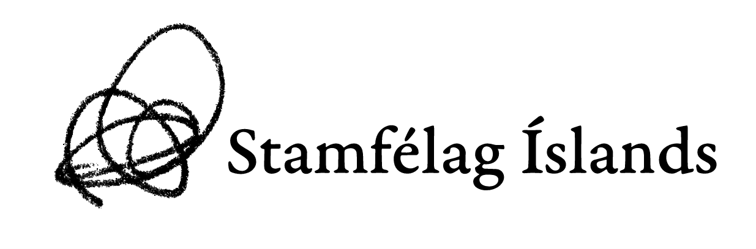
Following the name change of The Icelandic Stuttering Association, formerly Málbjörg, it was decided to give the association a new visual identity to accompany the name. Having been an active member of the association for a long time, I was given the task of creating the visual identity. The concept of the logo is derived from my oldest memory of imagining a stammer as a physical or tactile thing. During a workshop at a stuttering conference my mother took me to as a child, attendants were asked to draw a picture of their stutter on an outline of a body. I remember I drew a sort of bundle of lines. Something resembling what you might draw when trying to get a ball point pen to work. A knot of lines over the stomach of the outlined person.
I felt then, and still feel my stutter as a sort of knotted ball of chaos. Most of the time I can feel it in my stomach but sometimes it moves around. It is not static or set in a certain shape. It morphs, expands and contracts without any real pattern.
My stutter sometimes takes up a lot of space and demands my attention. Other times it seems like it’s just sitting in the background. Whether I’m speaking or quietly thinking to myself, my stutter is there. In my experience, a stutter is far more than a repeated syllable, broken word or a long, strenuous block. It’s a living, indescribable being. It’s how we experience it.
The logo is based on a personal experience because stuttering is a personal experience. It comes in countless shades and refuses to stay the same. The logo represents the experience of a person who stutters, not the experience of the listener.
 |
 |
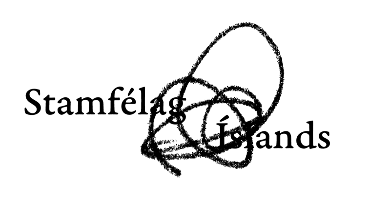 |

Your logo looks like a signature.The overlapping one is particularly “out of the box”. I struggled with designing a more unique logo for my local support group, as we haven’t been using a generic tiffany blue ribbon for decades.